By GINNY VAN ALYEA
Encountering a work of art can, in large part, be about the initial encounter and the first impression it leaves on the viewer. Do you like it, or does it make you uncomfortable? Is it two dimensional or 3D? Large or small? Dark or light? Do you think it’s beautiful? Is there a deeper message to interpret? The vast majority of art that you come across tends to be constructed on a relatable scale – a 2′ x 4′ painting on a gallery wall, or a near life-size sculpture in a park. When art is big – especially when it’s really big – the terms of the first impression change. You have to take the art in piece by piece, before you see the big picture.
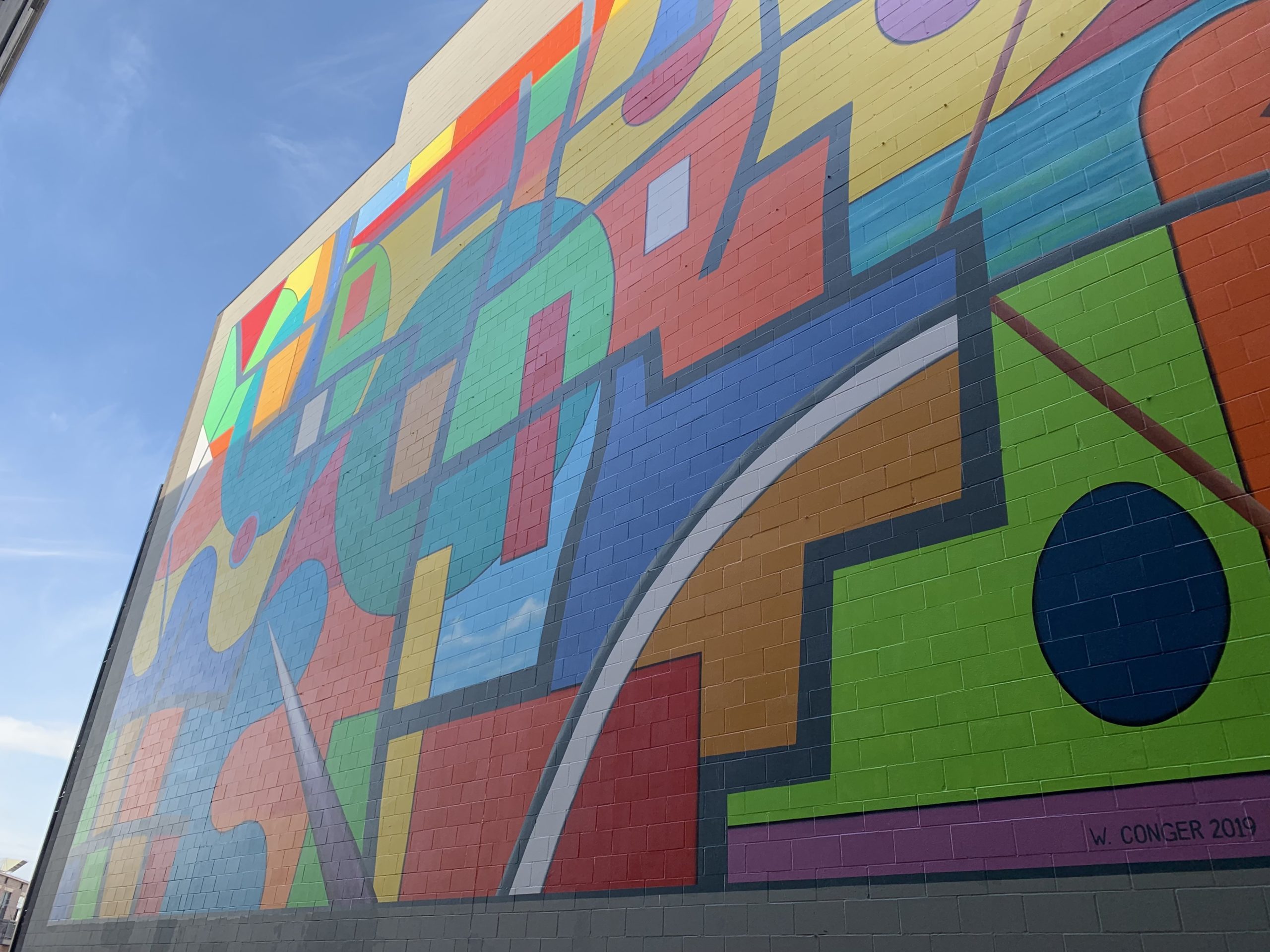
Last summer a collaboration, formed between artist William Conger and real estate developer Robert Koerner, resulted in a large-scale, months-long undertaking to create a work of art that will exist for decades and is sure to be enjoyed by many. I spoke with Conger and Koerner, as well as supporting artist Jeff Zimmerman, to find out how the project came to be and what it was like to bring an idea to life at 43 x 68 feet.
The mural, titled Chicago Trails, is the largest work Conger has ever created, and it is located in Lakeview near Clark and Belmont.
An edited transcript of our conversation is below. First we spoke with developer Robert Koerner, who selected Conger’s work for the project. Then we followed up with Conger himself. Finally we asked artist Jeff Zimmerman about his process for working so accurately on such a scale, something for which he is highly regarded and well known.
Note: CGN was asked in spring of 2019 to provide a list of mural artists for this project, and William Conger was part of that list. This interview is a follow up to share more about the project from start to finish.
Robert Koerner, Real Estate Developer
CGN: Please share a little about your real estate background.
Robert Koerner: I head the Midwest office of Standard Companies, a private investment company that was founded to create, preserve, and improve affordable, workforce, and market rate housing nationwide. Standard is one of the 50 largest affordable housing owners in the country (per Affordable Housing Finance, April 2019) and has acquired a portfolio of over 12,425 apartment units – of which more than 8,600 are affordable. Standard has completed more than $2 billion of multifamily investment, including 11 properties that we own in Illinois.
CGN: Have you always been interested in art?
RK: I was an Art History major at Brown University, and I have always tried to apply that background in my real estate career, usually focusing on the architectural elements of development. It was particularly gratifying to commission a painting for this project.
CGN: What inspired you to make art such a key part of this project in Lakeview?
RK: The first unit I saw in the building was a small studio on the lowest floor that faced a blank wall. Every time I walked into that unit (which was understandably vacant!) I tried to think of different ways to make it nicer. Painting a mural outside was a natural solution to turn that blank wall into a positive.
CGN: What made you choose William Conger to do the mural?
RK: After deciding to proceed with the mural, we had a hard time figuring out how to select an artist. We quickly decided that we wanted a local artist, and eventually concluded that an abstract image would fit the program best. William Conger has a long history in Chicago, which appealed to me, but the formal qualities of his work made the strongest impression. I particularly appreciated the illusion of depth and motion in his painting and felt that would be the perfect antidote to the flat, static wall that was blocking our building’s views. I also was curious to how his work could be transformed onto such a large scale (the finished mural is 43 feet by 68 feet!)
CGN: What do you hope residents appreciate about living with this mural?
RK: I hope the residents appreciate the thoughtfulness and attention to detail that went into the design. William [Conger] was very deliberate in laying out the mural to fit our building, including a fairly detailed analysis of how each window would face the completed image. Since each unit window reveals only a portion of the mural, William took great pains to ensure that there were “paintings within the painting” that made compositional sense. He also drew inspiration from the building’s location – the work’s title, Chicago Trails, alludes to Chicago’s diagonal streets (such as Clark Street, where our building is located), which echo the original Native American trails.
CGN: What were the challenges as well as some exciting elements of making an effort like this happen?
RK: One of the fun things about this project was that we hired a second artist, Jeff Zimmerman, to copy and enlarge the painting onto the wall. Jeff painted a mural by Kerry James Marshall onto the outside of the Cultural Center in 2016, and he has done many other murals in the city. William and I were both initially unsure how the finished mural would look, but after several weeks in Jeff’s studio and on scaffolding, Jeff produced a perfect replica of the original oil painting (the painting itself will be displayed prominently in our third floor lobby).
I was also concerned we wouldn’t get permission from the neighboring building to paint the mural on their wall, but as it turns out the owners (Craig Knapp and Bill Cline from Meta Properties) are great guys. We have become friends as a result of the mural.
William Conger, Commissioned Artist
CGN: How did you first approach this project?
William Conger: I began the project by consulting with Robert [Koerner], who commissioned it, visiting the site, getting photos, and obtaining architects’ plans for the building with the mural wall as well as for the building of apartments facing it.
Then I had to consider the first, and most difficult, challenge of creating a very large work that would be viewed in parts from nearby apartment windows instead of the usual long view for murals. Almost no one would see the completed mural as a whole at one time, and they would need to mentally assemble it from partial views, due to its proximity to the windows facing it.
I then began by making sketches and small gouache studies as I centered on the concept of Chicago’s vibrant history, which I’ve long studied.
A second challenge was to keep the mural scale in mind as I developed the concept and composition. I made little paper figures, which I attached to my studies, to keep me mindful of the ultimate size of the mural.
CGN: What was the inspiration for this work?
WC: I wanted to celebrate Chicago’s vibrant history and urbanity. The mural site is on North Clark Street, which traces the old Green Bay Trail, one of the many ancient trails that led to and from the hinterland to the Chicago River and Lakefront. Those trails became busy routes as Chicago’s population and commerce grew so very rapidly. They outlined, cut through, and shaped the many different Chicago neighborhoods where people from every part of the globe come to seek their dreams.
As with all my work, the mural, titled Chicago Trails, connects formal abstraction to the world of things and feelings by allusion. Just as abstract shapes always retain some ambiguous reference to other things, so do those things allude to abstract form and to art. As Chicago Trails alludes to the multi-faceted and interconnected energy of urban life, it also invites viewers to perceive their own energy, memories, and feelings as if they were abstract form and color.
The lines and bright colors of the mural both connect and divide the overall composition, enabling partial views that nevertheless lead to adjacent areas, forming new centers of interest. While working on the final sketch I imagined it embodying a spirit of free-flowing, figural animation suggesting a shamanistic dance, and maybe jazz, thus celebrating the different cultures intermingle in Chicago, embraced by the city’s architectural rationality.
CGN: Tell us about the actual execution of the piece and what it took to get it up on such a large surface.
WC: After completing sketches, I made a scale oil painting, 43 x 68 inches, as a model for the mural. Artist Jeff Zimmerman then made large outline drawings of that model, which he traced onto the prepared wall. He mixed quantities of a special outdoor acrylic paint perfectly matching the colors of my model painting. Then he had a scaffold placed and began to paint by hand, replicating my composition. It took Jeff about 6 weeks to complete the mural and then he coated it with a varnish. During his weeks of painting I visited the site and watched the progress and enjoyed talking with Jeff about his process. Since the mural wall is more than 90 feet high, I was glad not to be needed on the scaffold! Yet I could observe Jeff at work through various windows, amazed by his ability to perfectly paint a modulated shape as large as a truck from inches away.
CGN: What was it like to collaborate with another artist to bring your art to life?
WC: It was great working with Jeff! His confidence and skill erased my trepidations about how the enormous size and physical challenges of the mural. He enlarged an image of the mural painting onto large sheets of paper attached to his studio wall. Then he traced the outlines and punctured them with tiny holes. On the mural wall he “pounced” the holes, transferring dotted outlines to it. This laborious transfer process is identical to the method employed by Renaissance mural masters.
CGN: What are you working on now?
WC: I’m opening a show of new paintings for a solo show on January 24, 2020 at Zolla/Lieberman Gallery. These are smaller paintings, and somewhat experimental.
I also have a plan to begin working on a large fresh canvas, about 7 x 8 feet, that’s been staring at me in my studio for a year! It was fun to do the Chicago Trails mural, and I’m interested in developing its concept in another big painting.
CGN: Please share details about your process for taking a smaller scale work of art and translating it onto a large surface.
Jeff Zimmerman: I enlarge anyone’s work, including my own, by “pouncing.” I draw the artwork to scale on paper and use a pounce wheel to transfer the full size drawing onto the wall, where it becomes one big piece of artwork to be painted. It’s the same process Michelangelo used for the ceiling of the Sistine Chapel. I also use a special brand of acrylic that’s True Tone. It has enough pigment to last outdoors for a long time. From experience I’ve learned what colors will fade, so I avoid them.
CGN: What was it like to collaborate with William Conger?
JZ: I’ve collaborated with many other artists, including some other very established and internationally known ones. William was really easy to talk to, which made it easy for him to guide me verbally to achieve his needs. I think it was one of my best collaborations ever.
CGN: What else have you been working on?
JZ: I’ve got a new body of my own work in my studio, and I created a piece of street art for Hermosa [near Humboldt Park] recently. I’m also prepping for upcoming projects in Lucerne, Switzerland and in Mexico.
This past fall I put Andy Warhol’s Orange Marilyn onto the side of 633 N. Michigan Avenue for the Art Institute of Chicago’s exhibition (on view through January 26, 2020)


